The inspiration behind our posters
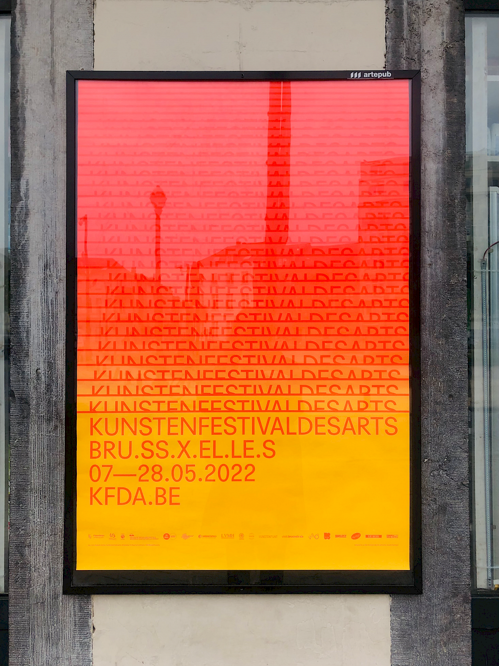
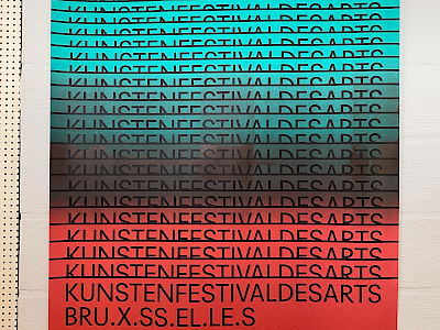
You may have seen one of our posters, spread around Brussels in May. But did you notice that each of these posters was unique? The process created by Pierre-Philippe Ayoh Kré Duchâtelet and Lionel Maes (La Villa Hermosa) allows the superposition of two parallel movements between the printing of the colour and the movement of the logo. An artistic and technical detail that they explain to us:
The communication materials that we have been producing for Kunstenfestivaldesarts for the past 3 years are nourished by several reflections on both technique and image, mechanical printing processes and computer software writing. Among the many communication tools and formats that we produce for the festival, the series of posters (screen and offset printed) is the best example of the intertwining of these technical and visual aspects. A block of text is progressively revealed over the height of the poster, while following two parallel movements: the first vertical, from top to bottom ; and the second horizontal, from left to right. This process is carried out within a software that we designed and developed for the festival, allowing this principle to be applied to all formats. Two colours are chosen to identify an edition of the festival and to differentiate it from previous ones and depending on the optical vibration effect they produce.
The posters are printed using screen printing and offset printing. The gradient is produced directly in the machine. The ink is distributed at the time of printing which produces a series of variations from one poster to another. Some prints using the offset process – as was the case for the 2021 edition – are produced by altering the ink and water mixtures and changing the pressure settings of the plates. The images produced are thought of as the results of a programming process.
In parallel to this technical experimentation, the design of the visual identity of Kunstenfestivaldesarts evolved around several historical references: the decomposition of a movement within a segmented space (such as the use of the split screen in the cinema and particularly in the film credits of Saul Bass), the repetition, the diffusion and the amplification of a word (like a video of Judith Butler performing a human microphone in support of the Occupy Wall Street movement in 2011), the staging of the typographic body (such as the graphic experiments of Wolfgang Weingart on the letter M).
La Villa Hermosa is a Brussels-based graphic design studio composed of Pierre-Philippe Ayoh Kré Duchâtelet, Lionel Maes, Raphaëlle Lasausse et Thy Nguyên Truong Minh. More info on their website
Thanks also to our printers: Lezard Graphique and Drifosett.